Earlier this week railroad giant Union Pacific, UNP, filed its most recent quarterly report. This gives us an excellent chance to demonstrate just how precisely you can tailor the key performance metrics you want to track using Calcbench data.
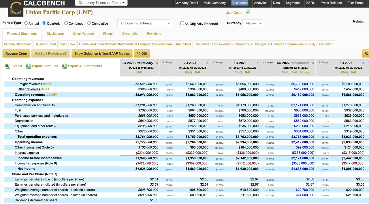
Let’s start with the income statement since that’s always a good place to begin with financial analysis. Figure 1, below, shows quarterly results for the last five periods.

As you can see, operating revenue dropped 9.5 percent, from $6.56 billion in third-quarter 2022 to $5.94 billion in third-quarter 2023.
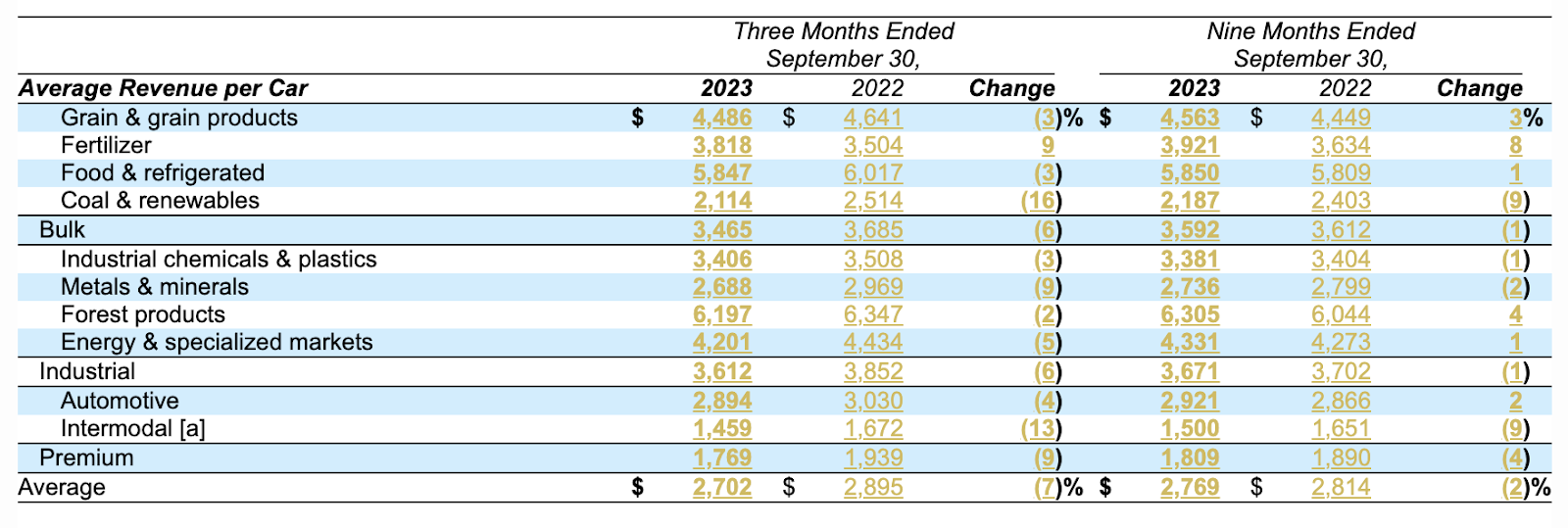
That decline in revenue is good to know, but honestly it doesn't tell you much about where within Union Pacific’s railroad empire those declines are coming from. To find out that information, you’re better off digging into the Management Discussion & Analysis. There, you can find average revenue per car, categorized by type of good. See Figure 2, below.

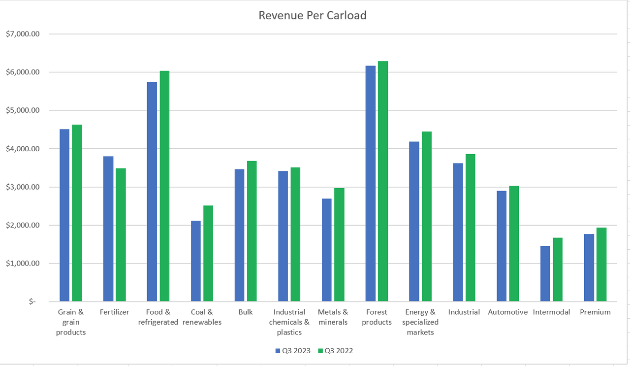
Nifty data, but a bit hard to comprehend in table format. So we used our "Export Table" functionality within our Disclosure Viewer and .... Presto! We now have an easy way to see changes in revenue per carload for each type of shipment Union Pacific offers. See Figure 3, below.

With our API and Excel Add-In, you can even automate exercises like this. The real challenge is in knowing what data is available for the companies you follow and how to find it.
Thankfully Calcbench has all sorts of data — including segment-level disclosures, non-GAAP items, and earnings release data. We work hard to find interesting examples to prove the analysis potential here; Union Pacific is today’s example. If you have other ideas for what we should research or questions about what we can find, drop us a line at info@calcbench.com any time.